Mindful Refresh
a brand that feels calm.
1 identity
playful and flowing, built around a sun icon and a colour landscape.
the context
David met Kate Title at a Federation of Small Businesses Bootcamp where Glued was exhibiting. Kate is a registered nurse, mentor, coach, hypnotherapist and mindset practitioner, ready to build a business offering coaching and courses to support nurses in their careers.
the challenge
Kate had devised the expressive name Mindful Refresh. The brief was an identity with a flowing design that was playful, using curves and a bright spectrum of colours.
what we did
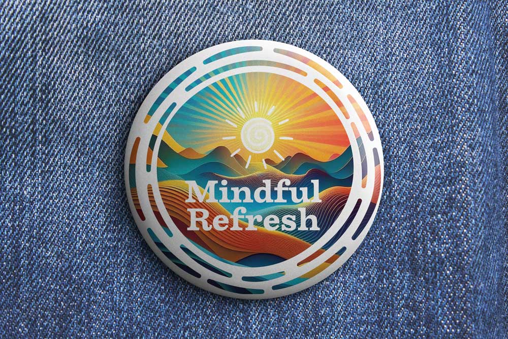
We developed a range of ideas and styles using different iconography. As the refinements took shape, the logo settled on a sun icon and a colour landscape, housed in a container that works on stickers or badges, to be worn with pride.
the results.
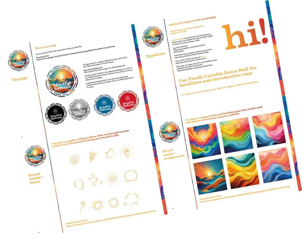
- 1 logo with a relaxed feel
- slab serif a strong typeface to support the logo
- patterns and icons for a wide range of communications
The brand gives Kate the flexibility to create a wide range of communications, including templates on the Mastermind.com platform.
I love it. I saw it and my brain sighed a little bit. In a good way! I want to print it out and put it on my wall. It makes me feel calm when I look at it.
Kate Title, Founder, Mindful Refresh
could this be your story?
The first conversation is with me, and it costs nothing.